Just, a pamphlet. Something people rarely use nowadays. It's fold-able.
College blog. A Graphic Designer in training! More into cartoons and character developments than typography.
Showing posts with label sorry. Show all posts
Monday, September 28, 2015
Halloween Horror - Movable Types
Elegant type, painted with gold. High-class, charming, important, yet unpretentious.
Friday, September 25, 2015
Matte Painting [EDIT]
A matte painting is a painted representation of a landscape, set, or distant location that allows filmmakers to create the illusion of an environment that is nonexistent in real life or would otherwise be too expensive or impossible to build or visit.
My inspiration was to combine floating islands with distant, icy feel. An abandoned floating kingdom, slowly succumbing to its doom by an ever-closing star.
The setting is in outer space.
Two floating islands in the distance. Pure ice. I played with the colour balance to give it more blue, and increased its curve to give it a glaring highlight.
I added a simple cave. The cave comes from another image I cut and edited.
Front island. Using a soft round brush, I added soft glow around the islands, giving them an other-wordly feel.
I added rainbow waterfalls for two of the islands, showing how they still function properly, and still retains their magical properties.
I added a bit of aurora beaming from the front island. The tip of the ice which has a strong yet subtle glow catches the attention.
I added a tower for the middle ground island. The overall image is that of an abandoned ice tower.
To make the waterfalls more mystical, I added soft white glow by using a soft round brush.
I added fog to deepen the mysterious feel of the whole kingdom. Desolated, yet has a calm and soothing beauty.
I added the imposing star that is coming ever-so-close towards the icy kingdom, the island that is closer towards the star shows its crumbling state by slowly turning a sickly blue. Its waterfalls also stop flowing because of the invading star. More fog was added to the foreground.
[I edited the fog, making them look more natural and less out of place/rough]
Monday, December 15, 2014
Elements of Graphic Design
Without these elements, design probably won't be able to come to life, let alone delivering important (or not so important) messages to the people. I've located a few small items in my room to show how elements of graphic design work in harmony with each other to create something inspirational.
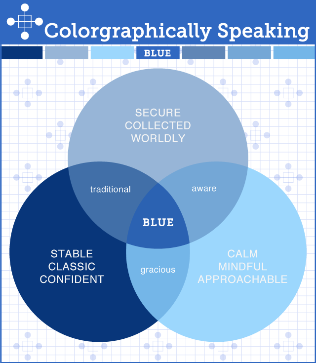
Garrett's popcorn bag utilises stripes of different blue to create a linear and clean design. The stripes give off a look of perfection, something Garrett hopes to present in his popcorn. The recycled paper texture is also a step forward for gourmet popcorn such as Garrett in order to differentiate themselves from plastic tub and plastic bag popcorn. This image sums up why they used blue for their design.
This is how the bag looks from behind. Witty design right there, capturing the hearts of narcissists and whoever wants to cheer themselves up with a bag of sweet, sweet popcorn.
KARE strives to be different, unique and most definitely the odd ball out. It has a variety of astounding furnitures and home deco that just screams "I am the one". Naturally, its magazine has to deliver that kind of feeling towards the consumers. Thus the over decorated cover page that seemed to cram some of its most desirable furnitures together along with bright colours, and yet somehow look aesthetically pleasing. (Or it's just too bizarre that you're trying to figure out what's 1+1) However, information is not lost in this barrage of colours and mayhem. The white fonts give contrast to its darker and more colourful background, making the headlines and contact information readable.
This movie poster, in my opinion is ingenious yet somehow pretty obvious. (Penguins = black and white = zebra crossing) Not much colour is used in this poster but the design is clear and they are closely related to the movie's characters.
A lot of shapes are used in this design, constructing several items of harmony in its place. The colour scheme is in balance, ranging from dark red, gold brown and ceramic white that shows how "PRECIOUS" everything is in MPH's catalogue. Simple and straight to the point, its title expressess how much it means to have precious memories that you can cherish for years to come, and how you can express your gratitude and love through words. (literally because books) Its wooden table texture also adds a sense of nostalgia to the whole picture, while making your precious memories seem more real and tangible.
This pair of shoes are so huge, it demands your attention. Look at how sleek it is, the leather is shining and it looks so comfortable that you want to buy it. There you go, smart design right there, because the purpose of this design is to attract your attention and make you want to know more about their product. It grabs attention with a mere image of a pair of shoes and most women are probablye hooked. (OL maybe?) Notice that pink font right there? INSPIRE DESIRE. That's the whole gig, this poster's sole purpose. To inspire that desire in you.
Strabucks retain their design layout for all of these brochures to have a sense of familiarity and belonging. The little objects put together in perfect harmony blends well with the choice of colours. Nothing particular stands out, but nothing else gets forgotten either. It seems that even though the logo might not be present you can still distinguish it as a Starbuck's brochure because its linear and constant layout.
A postage is designed to be obvious and clear. The information are seperated by segments and columns so nothing gets mixed up. It is important for the address to be clearly written in larger fonts to make deliver a breeze (the blacked out section) Especially air mail because, it travelled so far and nobody wants it to suddenly go M.I.A.
A very simple magazine layout. The focus is on the variety of food packed in one corner that makes readers want to know more about this column.
Comic layout is also part of graphic design. The narration is delivered smoothly while the story progresses without being too jumpy or too fast. Boxes of different widths and heights are used to show all kinds of emotions and feelings in a comic.
There are a few bad designs that didn't properly utilise the elements of graphic design in their work, such as:
This clearly too cramped and eye piercing magazine catalogue. Although they seperate segments with thicker lines, the information are still too packed together to properly enjoy reading it, let alone finding what the consumers want!
Although the continents and countries are numbered, it is still very troublesome to flip the poster over to know which country belongs to which number. Maybe the more well known countries are a dead spot on, but how about the smaller countries that aren't that recognisable?
There are many more designs out there that knows how to properly mix and match elements of graphic design together to create semblance between them. They are important and crucial for a design to function properly and to achieve its main purpose --- delivering messages to the people.
Friday, December 12, 2014
Colour Study
These are the assignments from our colour study lecturer, Ms Cheryl. I am so sorry for the unkempt and jittery linework because my hand twitches A LOT. :(
Simple colour wheel, simple naming and simple understanding. Please ignore the upside-down "Red" and some other labels that are clearly unsynchronised.
The colour of the Sun, that one orange on the table and maybe that piece of bright colour paper. Blood?
Green colour is just as creative as any other colours! Blue is for the salty sea and purple is for when you feel like puking all over the place but can't.
This is Colour Value, where by slowing mixing white into primary colours we get different shades of the original colour. There is a difference if you squint hard enough.
One of the colour wheel's many offsprings. (Complementary, Triadic and Analogous is absent at the moment)
Colour harmony, colours blending with each other, colours that enjoy each other's company, colours that just goes so right with each other.
This is not finished, but I like how he looks with the glasses. It's as if he's giving off a mysterious aura. Will update as soon as I can. (Proudest so far if you can't tell UuU)
Friday, October 17, 2014
Updated
I've updated some posts from before.
Basic Computer Technology Final Assessment, Gray scale function post(additional task thing), and Typography Final Assessment.
Sorry for the randomness.
Basic Computer Technology Final Assessment, Gray scale function post(additional task thing), and Typography Final Assessment.
Sorry for the randomness.
Tags:
LOVELY STUFF,
sorry
Art History
Mr Tham never requested any notes from us, but he did ask us to make posts about what we've learnt during each of his lessons so he'll know how much we actually understood from his class.
I didn't made any long posts about all the key artists and eras we learnt because I thought it unnecessary. We learnt about what they did and the movement they created, about how they changed the aesthetic value of a piece of artwork during their time period but that's all in the past.
I think, we get to know more about what little we knew, and know a whole lot more of what we didn't knew. That itself is just a phase we have to go through, in order to absorb more knowledge about them, the meaning behind their art and why they chose this path as an artist.
I learnt so much about so many artists, and now I know the meaning behind a few of their famous paintings (why they got famous). It helps me find a path towards my own goal, my own style. I don't think we should follow in their footstep, we only need to understand them and see them as our stepping stone towards our own personal goal.
There are so much things to write about them that I don't think anyone's going to go through all of them. (internet slang tl;dr) That's why I just want to say, I've learnt so many things, so many concepts and delved into these famous artist's subconscious minds that it's amazing all on its own. The videos were inspiring, and they convey the artist's approach towards life and art in an absorbing way. All in all, art history was very interesting because we've learnt so much, and it feels like we still need to know more about the history of art before we can finally tell people how amazing being an art student is, because we know something beautiful yet painfully logical and mind numbing at the same time.
Personally I fell head over heels for Frida Kahlo. I also enjoy seeing Jackson Pollock's drip paint artworks.Wonderful things
I can pretty much get most of the information from this website (whenever I need a fresh new reminder or inspiration)
Very Informative on famous time periods and artists involved
I didn't made any long posts about all the key artists and eras we learnt because I thought it unnecessary. We learnt about what they did and the movement they created, about how they changed the aesthetic value of a piece of artwork during their time period but that's all in the past.
I think, we get to know more about what little we knew, and know a whole lot more of what we didn't knew. That itself is just a phase we have to go through, in order to absorb more knowledge about them, the meaning behind their art and why they chose this path as an artist.
I learnt so much about so many artists, and now I know the meaning behind a few of their famous paintings (why they got famous). It helps me find a path towards my own goal, my own style. I don't think we should follow in their footstep, we only need to understand them and see them as our stepping stone towards our own personal goal.
There are so much things to write about them that I don't think anyone's going to go through all of them. (internet slang tl;dr) That's why I just want to say, I've learnt so many things, so many concepts and delved into these famous artist's subconscious minds that it's amazing all on its own. The videos were inspiring, and they convey the artist's approach towards life and art in an absorbing way. All in all, art history was very interesting because we've learnt so much, and it feels like we still need to know more about the history of art before we can finally tell people how amazing being an art student is, because we know something beautiful yet painfully logical and mind numbing at the same time.
Personally I fell head over heels for Frida Kahlo. I also enjoy seeing Jackson Pollock's drip paint artworks.
Very Informative on famous time periods and artists involved
Tags:
art history,
final assessment,
help,
so much words,
sorry
Subscribe to:
Posts (Atom)